2013
Book, drawings, images
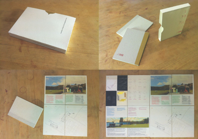
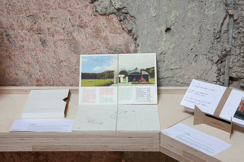
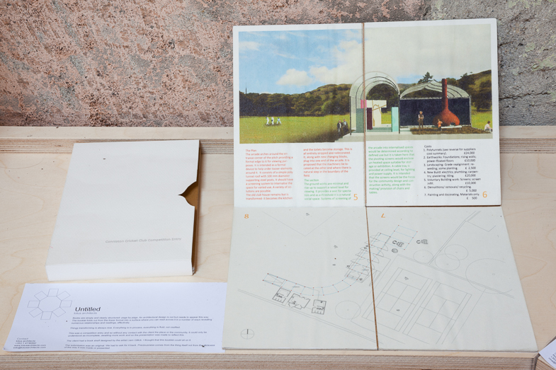
Books are simply and clearly structured- page by page. An architectural design is not but needs to appear this way.
The booklet folds out from the linear format into a surface where you can read across it in a number of ways revealing numerous relationships and readings, effectively.
Things transforming is always nice. Everything is in process, everything is fluid, not ossified.
This was a competition entry and so without any contact with the client the place or the community, it could only be understood as incomplete, awaiting more work and so the presentation was made to reflect this.
The client had a book shelf designed by the artist Liam Gillick. I thought that this booklet could sit on it.
The submission was an original. We had to ask for it back. Preciousness comes from the thing itself not from the slickness of the way it was made or presented.


